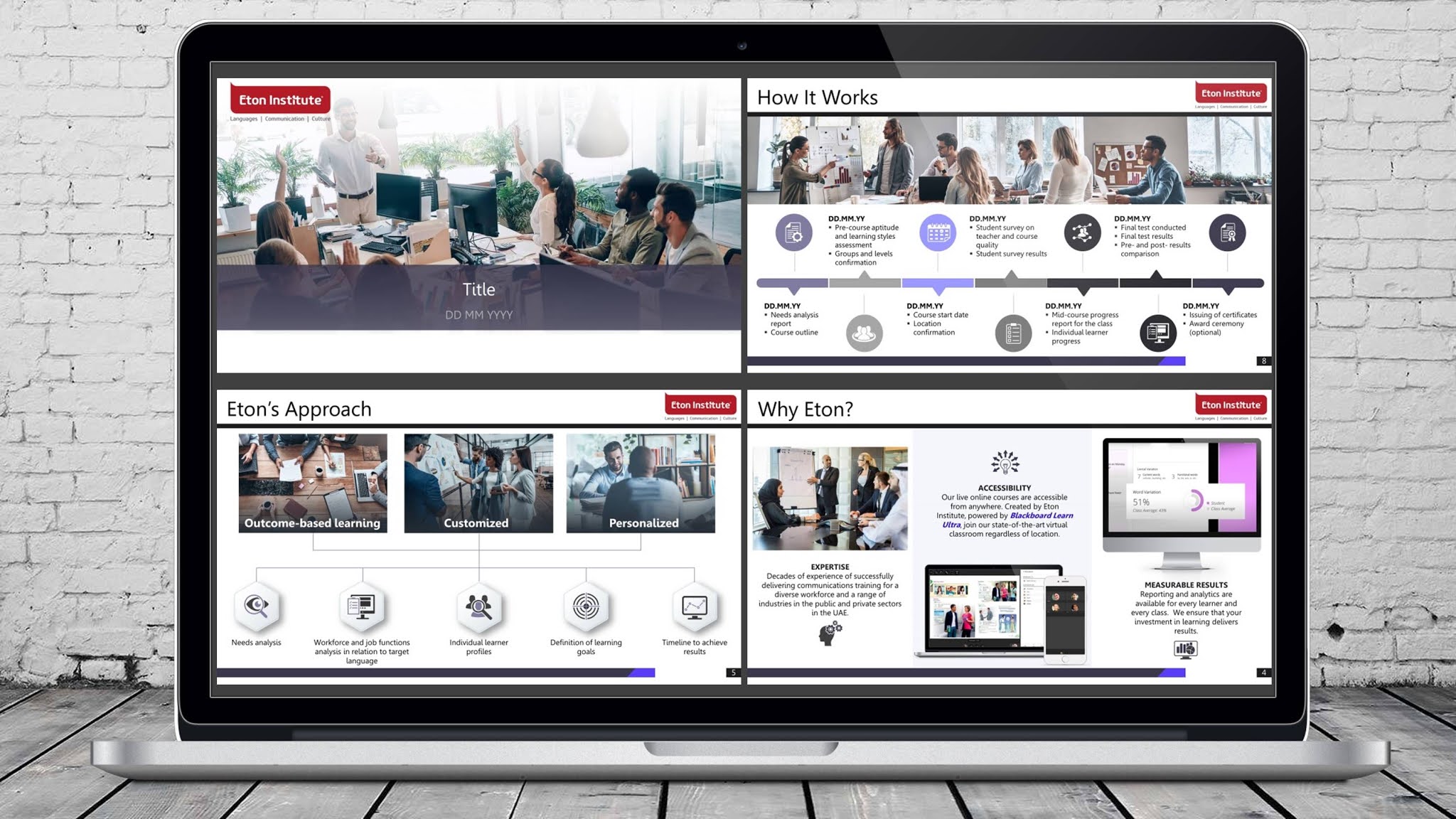
When Eton Institute reached out to us, they weren’t just looking for another slide deck. They wanted a marketing pitch that could clearly show why they lead the way in language training and professional development in the UAE. The challenge? Turning detailed service offerings into something visual, structured, and convincing—without overwhelming the audience.
The Goal: Clarity, Confidence, and Conversion
They needed a deck that:
- Breaks down complex services into digestible slides.
- Aligns visually with their brand.
- Builds trust through proven success stories.
- Supports sales conversations across industries.
This wasn’t just about throwing some bullet points onto slides. Eton needed a presentation that could speak to corporate HR teams, government training departments, and international clients—each with different expectations and priorities. That meant every slide had to pull its weight.
The Process: From Concept to Final Slides
Before we opened PowerPoint, we sat down and mapped the flow. We wanted the deck to feel like a conversation, not a lecture. Think: “Here’s what we offer. Here’s how it works. And here’s why it gets results.”
Slide Breakdown Strategy
We broke the content into key areas:
- Introduction & Credibility: What Eton does, who they serve, and what makes their training effective.
- Methodology: Their outcome-focused approach and LMS-powered delivery model.
- Customization & Flexibility: Industry-specific learning, personalized course design, and learning options (on-site and online).
- Results That Speak: Highlighted three strong success stories, including data points showing measurable progress.
- Why It Works: A recap of their benefits and client wins.
- Next Steps & Contact Info: Clear call to action and direct contact details for faster follow-up.
We used design to guide attention. Strong headers, short text blocks, and clean visuals. Every page felt intentional. No filler.
What Made This Deck Stand Out?
Here’s what the client loved—and why it worked.
1. Clear Message with a Visual Edge
The messaging was tight. We avoided overloading the slides with paragraphs or technical lingo. Instead, we leaned into simplicity. Big ideas, clean icons, supporting graphics. For example:
- Instead of listing all their courses in one chunk, we grouped them into themes: "Professional Skills," "Language for Special Purposes," and "Testing & Certification."
- For their LMS-powered platform, we included a graphic showing how students and instructors interact digitally, without digging into the weeds of tech specs.
That clarity gave their team more confidence during meetings—and less reliance on reading slides word-for-word.
2. Real-World Wins
Case studies can often feel like fluff. Not here. Eton gave us strong before-and-after stories. We turned those into powerful, data-backed slides. Here’s one:
- Dubai Parks & Resorts Program (2016):
700+ young Emiratis started the course at IELTS Band 3. After three months, they saw an average improvement of 3.75 points. That’s significant. We made sure this wasn’t buried in fine print—it became a visual anchor. - Emirates Diplomatic Academy:
Since 2014, 273 diplomats have passed through their customized language program. We highlighted the 100% pass rate and language range (Farsi, Hindi, German, Spanish, and more) to show depth and scale.
That kind of credibility makes sales easier. It also builds trust instantly, especially with corporate and government clients.
3. Slide Design That Feels Modern
Let’s be honest: a lot of corporate decks feel like they were built in 2006. Fonts are clunky. Layouts are chaotic. Nothing flows.
We flipped that.
- Fonts were clean and easy to read.
- Icons matched the brand and supported comprehension.
- Slide colors echoed Eton’s branding while staying presentation-friendly (no harsh contrasts or gimmicky effects).
- We kept each slide focused on a single idea. No cognitive overload.
The design helped carry the message, instead of competing with it.
4. Built for Flexibility
Some decks only work if you’re presenting them live. Others make sense only if you’re reading them like a PDF. This one had to do both.
- We made sure the flow worked whether someone was presenting it on a Zoom call or emailing it to a procurement officer.
- Slides included just enough context to make sense on their own—but not so much that a presenter couldn’t add their voice.
That flexibility made this deck a real asset for their sales team.
Bonus Touches That Helped the Pitch Deck Land
- A Visual “How It Works” Timeline:
Instead of listing steps in a process, we visualized the client onboarding journey. From needs analysis to course delivery and certification. This helped decision-makers see the process before committing. - Client Logos and Testimonials (Optional Slides):
We gave them space to include partner logos or brief testimonials, depending on the audience. These were modular, so they could turn them on or off based on who they were meeting with. - Language of Value, Not Just Features:
Throughout the deck, we framed the content around benefits. It wasn’t just “we offer 30-hour courses.” It was “each level can be completed in 30 hours with live instruction, helping learners apply the language in real-time.”
What the Client Said
The Eton Institute team told us they were impressed by how well we captured their value proposition without overselling. They felt the deck matched their tone—professional but not stiff. Informative but not dry. Easy to use in both casual and formal pitches.
They’ve since used the deck in proposals to corporate clients, training initiatives for government organizations, and even internal presentations.
This pitch deck helped Eton Institute simplify a multi-layered offer into something visual and persuasive. It connected the dots for their clients—and gave their team something they were proud to present.
Need help turning your services into a deck that sells without sounding salesy?
We’d love to build something sharp and effective for you too.


0 Comments